Project Overview
The Product
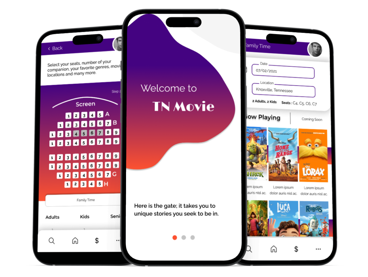
TN Movie Theater is a local cinema located in Knoxville, TN. It targets customers who want to find and buy tickets based on their favorite seat selections. To make the check-out experience quicker, TN Movie Theater offers saving seat combinations based on occasions.
December 2021 to May 2022.
Project Duration
Tools Used
- Mural
- Figma
- Pen and Paper
The Problem
People don’t want to spend time buying a ticket if their favorite seats are sold out for the movie.
The Goal
Design a new app to help people discover seats before dealing with movie search, upselling, and payment to make their ticket-buying experience quicker.
My Role
UX lead – Gonca Onusluel Hepekiz
Responsibilities
Conducting interviews, paper and digital wireframing, low and high-fidelity prototyping, conducting usability studies, accounting for accessibility, iterating on designs, prototyping, and responsive design.
Understanding the User
User Research: Summary
I conducted interviews and created empathy maps to understand the users I was designing for. A primary user group identified through research was working adults who don’t want to spend time purchasing a ticket if their favorite seats have already sold out.
User Research: Pain Points
Persona
Problem Statement
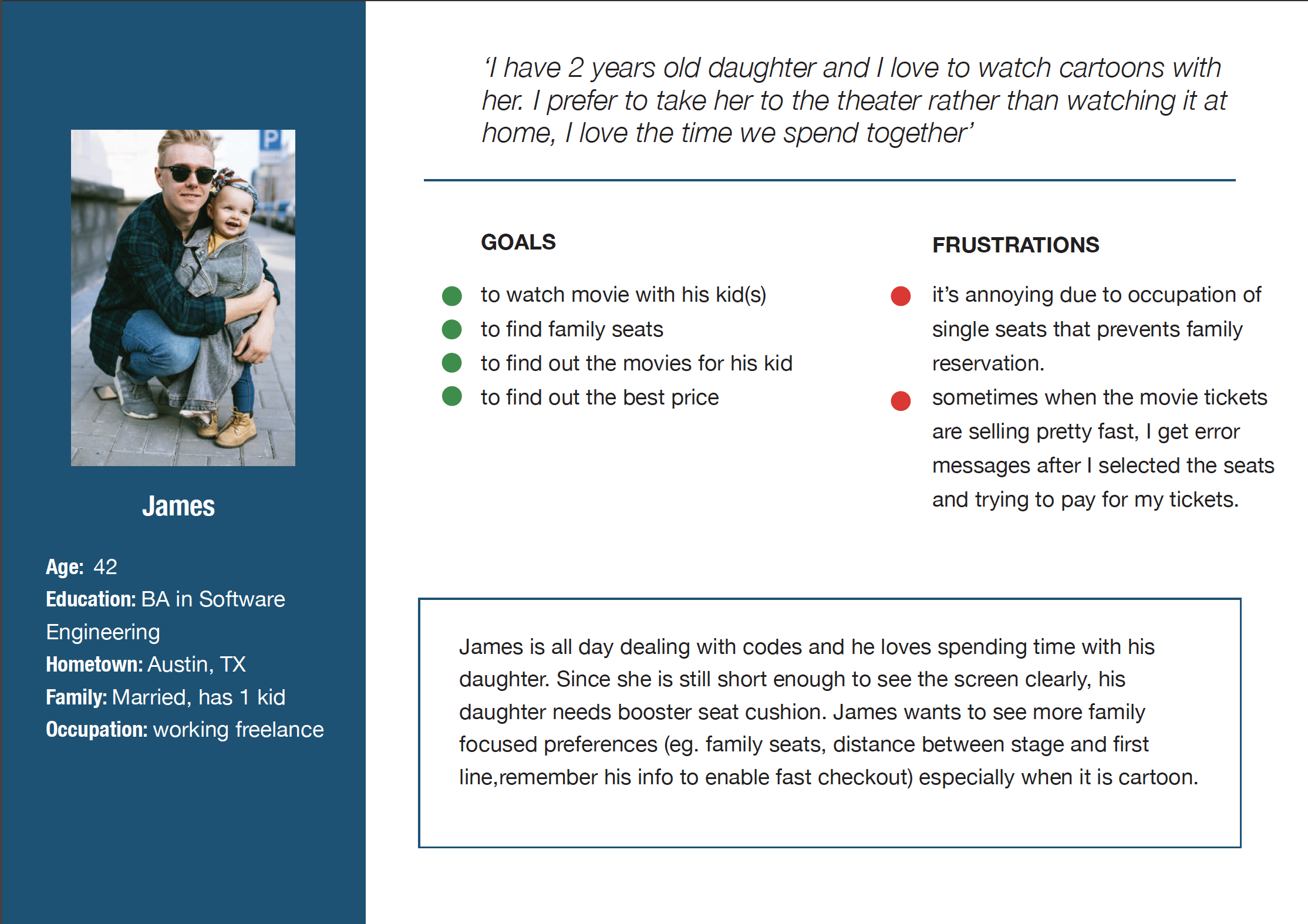
James, an engineer who spends a significant amount of time in front of the computer, is eager to share quality moments with his 2-year-old daughter at the theater. He is determined to secure the best seats for their special daddy-daughter movie time.
User Journey Map
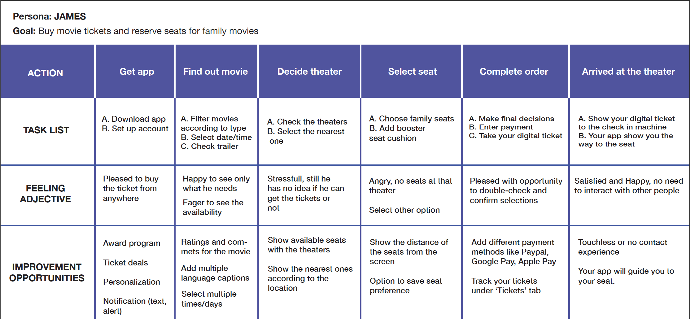
Here is a journey map illustrating James’s experience. This map was instrumental in identifying potential pain points and uncovering opportunities for improvement.

Starting the Design
Paper Wireframes
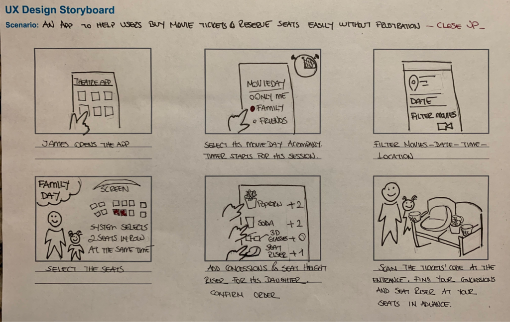
The initial versions of the app’s screen iterations concentrated on incorporating features that effectively addressed user pain points. I gave precedence to enhancing the personalization of the home screen experience, aiming to streamline the process and save users time when purchasing movie tickets.
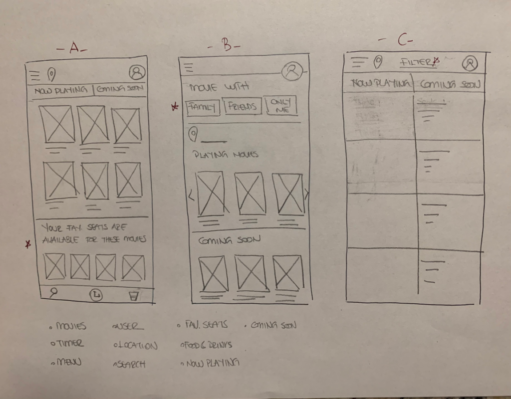
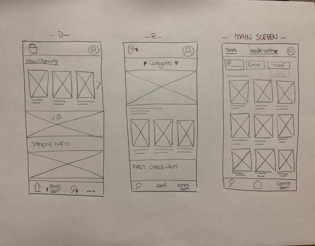
Stars were used to mark the elements of each sketch that would be used in the initial digital wireframes.
Digital Wireframes
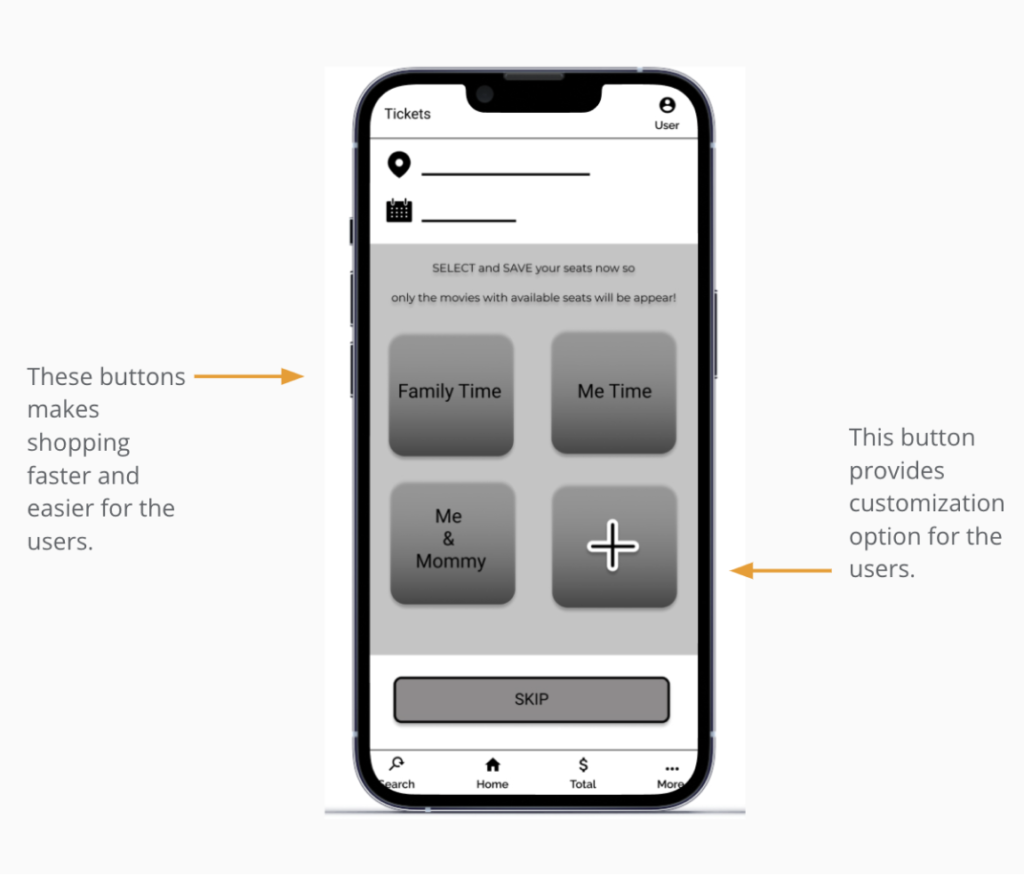
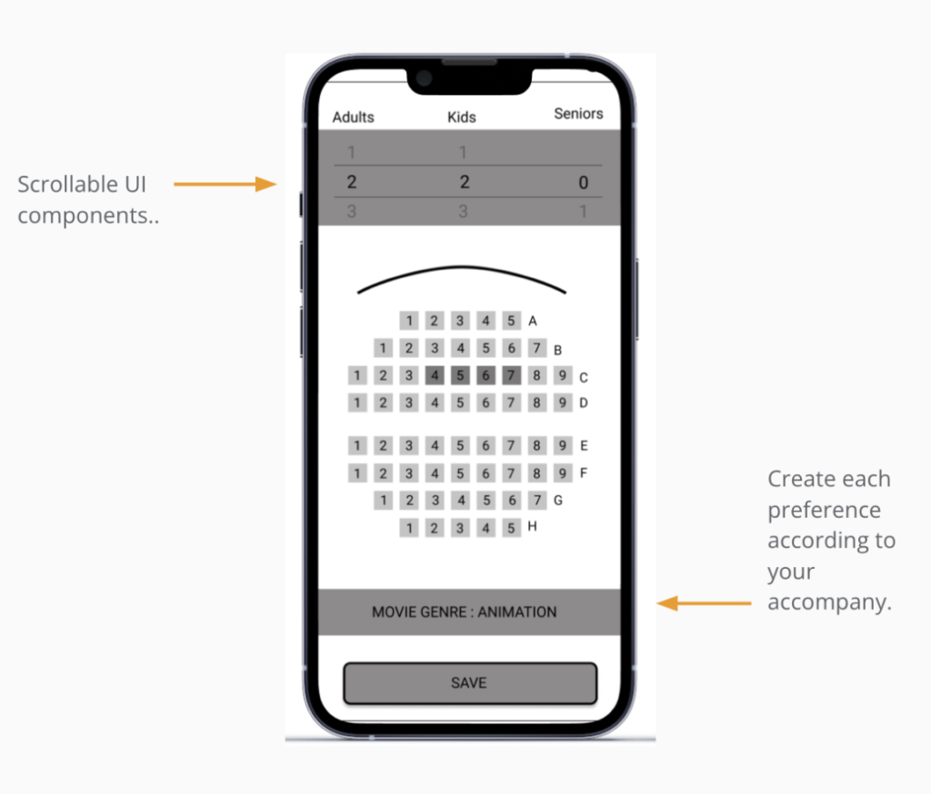
The following screenshots are the initially designed screens after paper prototypes. Easy-to-understand flow and saved custom preferences make the user journey more direct.
Low-Fidelity Prototype and usability study
Utilizing the finalized digital wireframes, I generated a low-fidelity prototype, which was then employed in a usability study to evaluate the primary user flow.

Usability Study: Parameters
I executed two sets of usability studies. Insights gathered from the initial study informed the progression of designs from wireframes to mockups. In the subsequent study, a high-fidelity prototype was employed to identify areas in the mockups that required refinement.


Usability Study: Findings
The items listed below are the main findings uncovered by two usability studies for this project.
Round 1 – usability study Findings
Round 2 – usability study findings
- Creating an account should be quick and straightforward.
- Clear and concise guidelines are essential for users.
- Users want to select seats effortlessly and have their preferred seating remembered by the system.
- Hidden fees at checkout frustrate users; they prefer transparency throughout the process.
- Buttons lack clarity and are difficult for users to understand.
- The customization process is unclear and leaves users feeling confused.
Refining The Design
Mockups
After conducting usability studies, I gathered key insights and enhanced the designs by incorporating additional options and making necessary revisions.
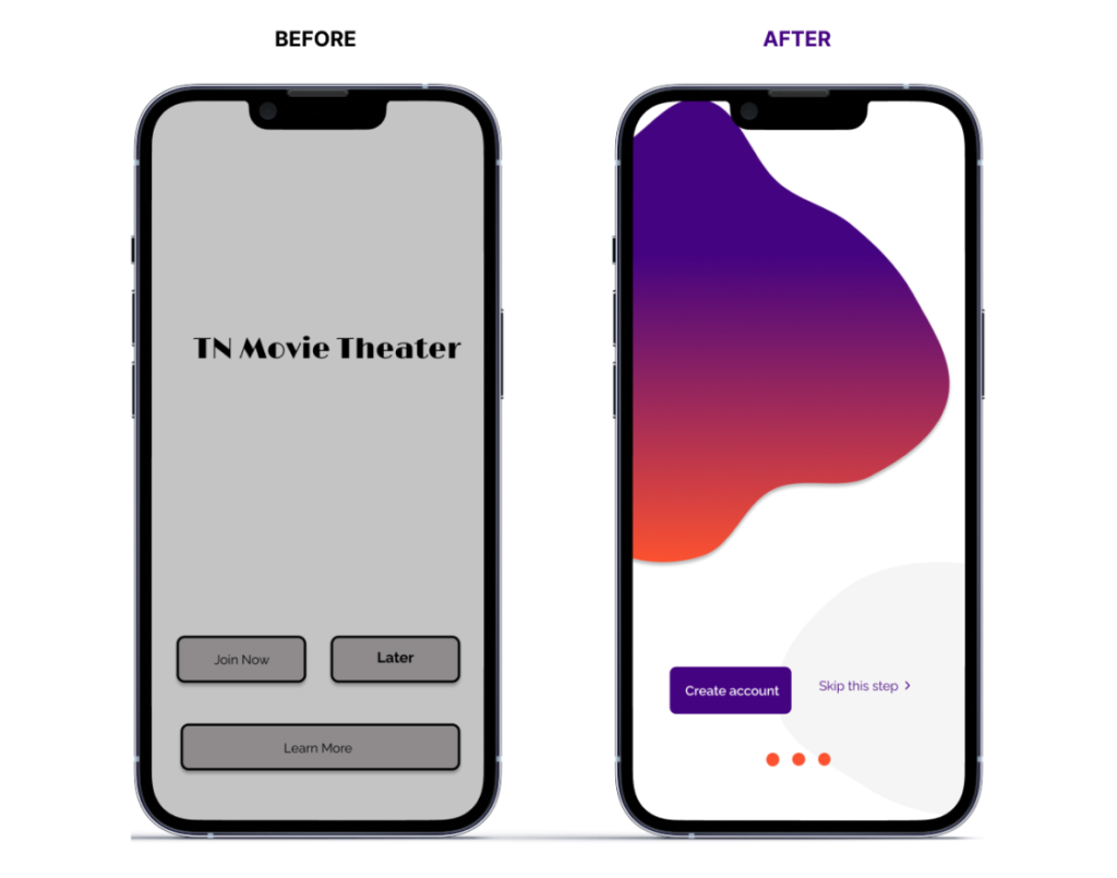
Insight 1: Make it inviting; keep it concise.
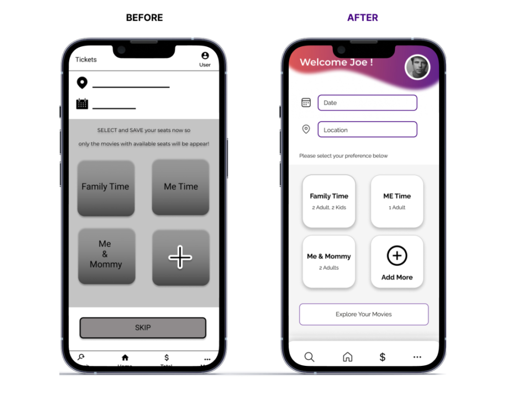
Insight 2: Make it easy to customize to set seat preference.
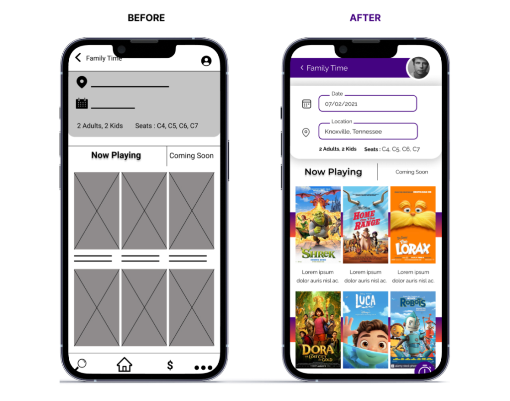
Insight 3: Make buttons larger and clickable.
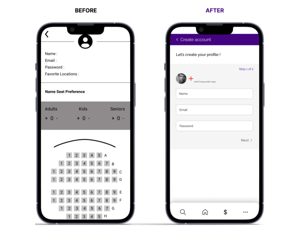
Insight 4: Exclude seat selection in the account creation section.
High-Fidelity Mock Ups & Prototype
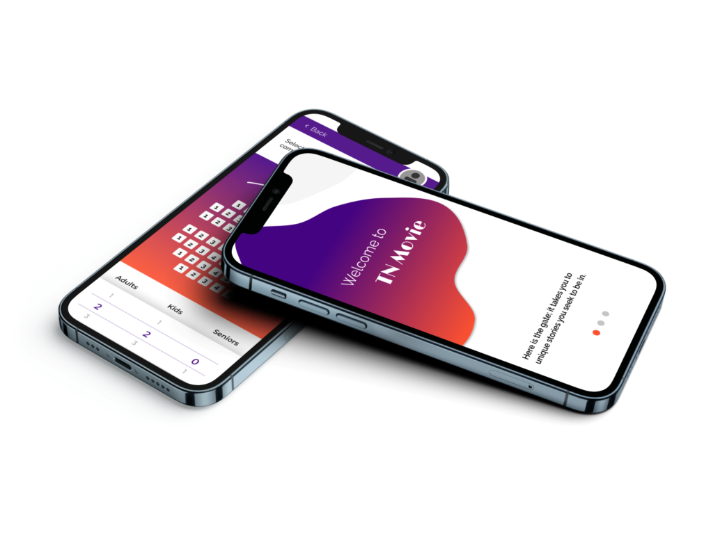
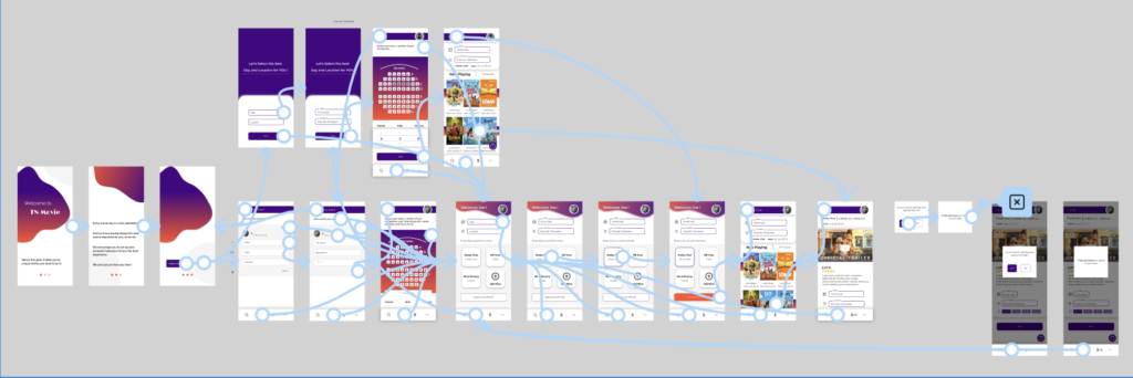
The ultimate high-fidelity prototype showcased streamlined user flows for purchasing movie tickets, effectively catering to personalized user requirements for a swift and effortless checkout experience.
Text Styles
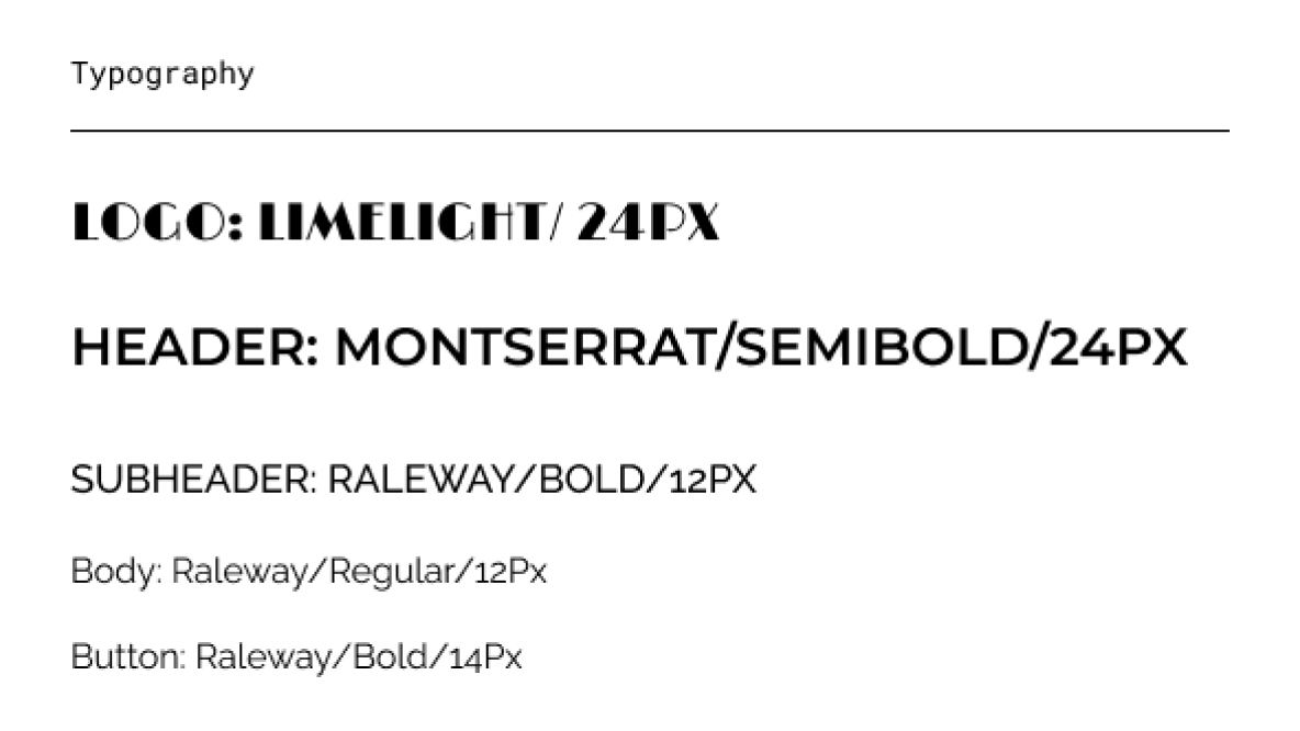
In this project, I used Montserrat and Raleway fonts. I arranged the text styling according to where it would be used.
Component Library
For the TN Movie Theater project, I opted not to use a pre-built component library. Instead, I focused on creating a custom, project-specific component library. Naturally, this library evolved alongside the design process to meet the project’s unique needs.

Color Library

High fidelity mock ups: original screen size
The conclusive high-fidelity prototype not only introduced more seamless user flows for purchasing movie tickets but also fulfilled tailored user requirements, ensuring a prompt and effortless checkout process.
Accessibility Considerations
Going Forward
Takeaways


Next Steps
- Conduct an additional round of usability studies to validate whether the identified pain points have been successfully resolved.
- Perform further user research to uncover any emerging needs or areas for improvement.
