Project Overview
The Product
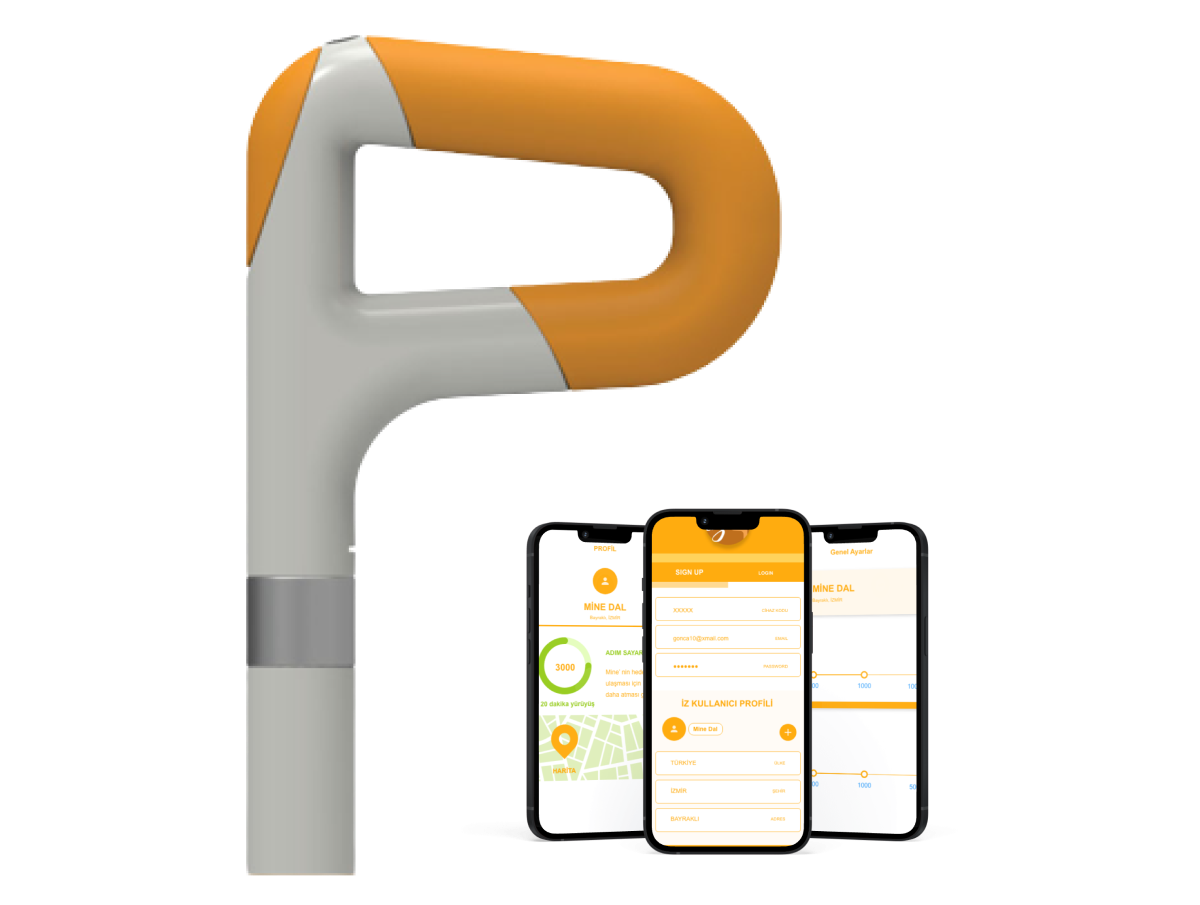
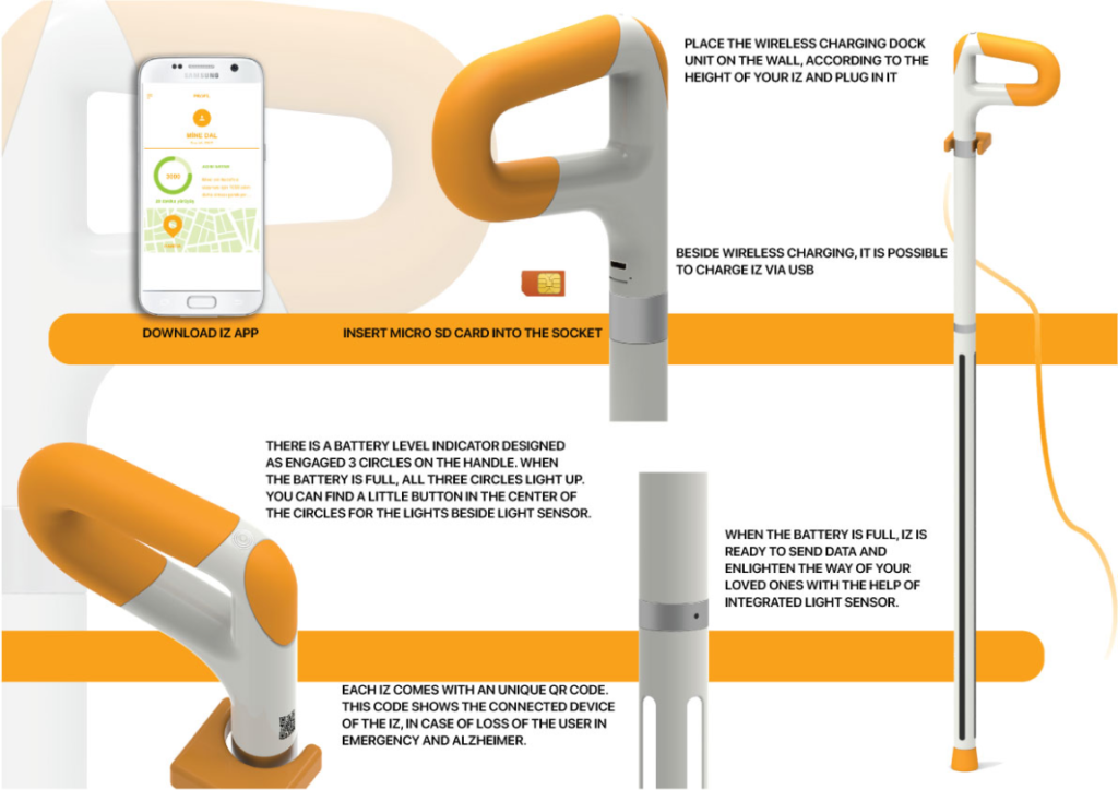
Iz is an intelligent walking aid designed to work alongside an app tailored for elderly individuals who require assistance while maintaining an active lifestyle. It collects the heartbeat, step, and route data of its users and sends them to the Iz App user. It takes care of your loved ones and stands by them. In an emergency, a unique QR code can be used to reach you directly.
Project Duration
September 2019 – January 2020
The Problem
Adults living apart from their parents desire a means to remotely monitor their active but independent parents, who require walking support. The challenge lies in the difficulty of consistently obtaining updates and tracking their parents’ whereabouts when they are outside the home.
The Goal
Design different solutions for adults and their elderly parents. The products should be usable for both user groups, and while working separately, they must communicate with each other to transfer information.
My aims were;
- integrating a smart device into the lives of people who are not familiar with smart devices in their everyday life
- using this smart device as a tool to connect them with their families
My Role
Industrial designer, UX lead, researcher
Responsibilities
Conducting interviews, paper and digital wireframing, low and high-fidelity prototyping, conducting usability studies, accounting for accessibility, iterating on designs, prototyping, and responsive design.
Understanding the User
User Research: Summary
I identified two distinct user groups for this project: adults and their elderly parents. During my research process, I assessed the outcomes separately for each group.
User Research: Pain Points
User research pain points (Elder parents)
1. usability
Current smart devices are complex to use, hard to understand.
2. feeling safe
I want to spend time outside but I have limited mobility.
3. feeling of connection
Ok, I have a mobile, but I always forget it at home.
User research pain points (Adults)
1. usability
Our parents refuse to use smart devices or mobile.
2. be informed
We want to know where they are especially while my parents are out.
3. time management
In a daily routine, we sometimes forget to check in with our parents.
Persona
Problem Statement
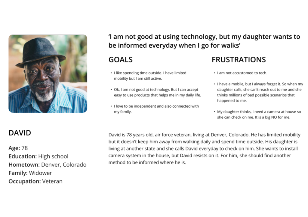
David is 78 years old, an Air Force veteran, and a resident of Denver, Colorado. He has limited mobility, but it doesn’t keep him from walking daily and spending time outside. His daughter lives in another state and calls David every day to check on him. She wants to install a camera system in the house, but David resists. She should find another way to get information about him daily.
Storyboard
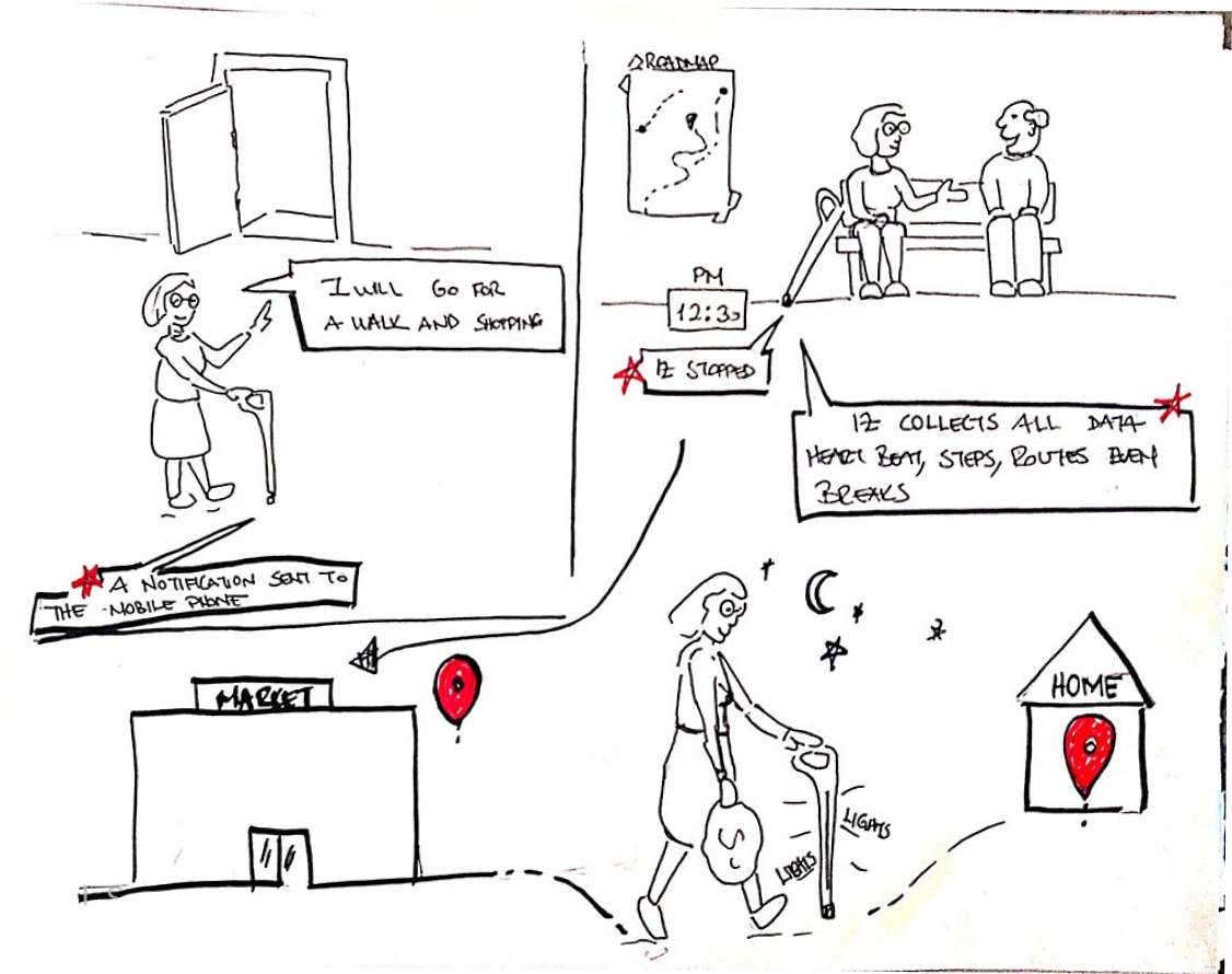
I created a user journey map outlining potential experiences for the user. The product must strike a balance between being familiar enough for seamless integration into users’ daily lives, while also possessing the necessary technological capabilities to transmit essential data to the application for effective communication.
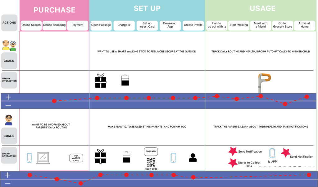
User Journey Map
This user journey map reflects the steps of two user groups in the same table. You can view where their experience stays neutral, positive, or negative during the flow.
Starting the Design
Industrial Product Design Renderings and Specifications
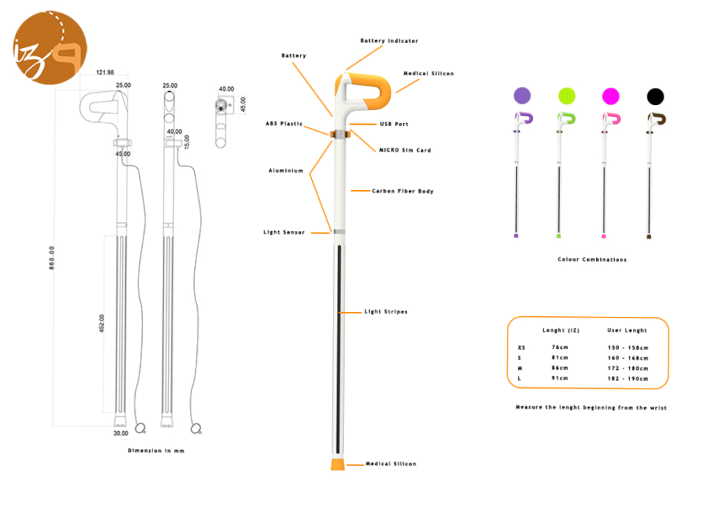
Iz project comprised two distinct phases: industrial product design and digital product design. I prioritized human metrics and ergonomics tailored to my user group during the industrial product design stage. In product design, careful selection of materials and production methods appropriate for the product is essential beyond conceptualizing the product. Below, you’ll find 3D renders of the Iz smart walking stick along with its specifications.
Digital Wireframes
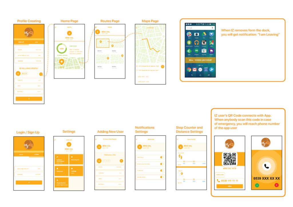
Iz is a mobile application-based project. Below are the frames related to adding a profile, settings, receiving notifications, the steps counter, tracking routes, and reaching out to the emergency contact.
Going Forward
Takeaways
impact
Our elderly users embraced the product idea, finding it both familiar and remarkably user-friendly. Our app users lauded the design for its simplicity and expressed confidence that it would enable them to discreetly monitor their elderly parents.
what i learned
I found that user needs are influenced by age and familiarity with technological devices. The accessibility is essential; I need to improve the text legibility and reconsider the colors used in the project. This project requires ongoing user studies; it won’t be concluded with just one user study.
Next Steps
- Improve the overall legibility of the application and set up another usability test round.
- Conduct more user research studies including the smart stick actual size mockup.
- Include ergonomics studies.
